The Photograph That Changed Nothing (And Everything)
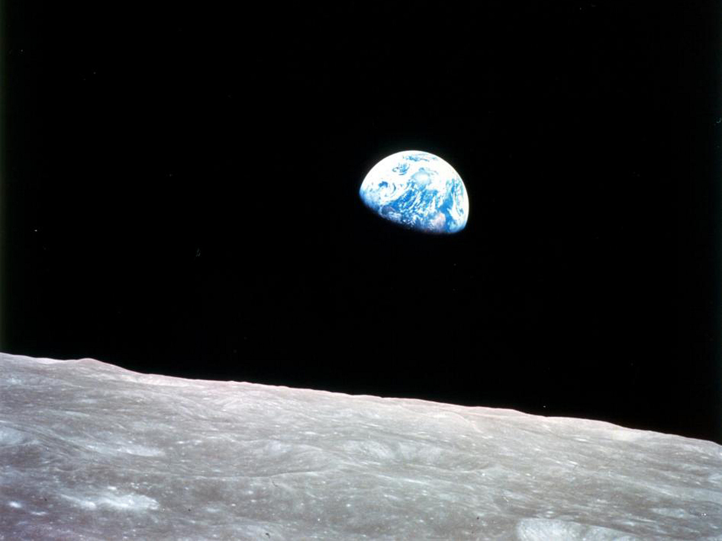
The first time I saw Earthrise, NASA’s 1968 photograph of Earth rising above the lunar horizon, I already knew everything it was supposed to teach me. I knew Earth was round. I knew it was finite. I knew it hung in space, isolated and fragile. I could recite the diameter: 7,917.5 miles. I understood orbital mechanics (kinda). I’d spent enough time photographing aerospace research at NASA Glenn; propulsion tests, clean rooms, wind tunnels, the daily machinery of how we actually get to space; to know what cameras captured and why every technical detail mattered.
The photograph taught me nothing new.
And yet.
Something shifted. Something I couldn’t name at first, but felt immediately. Like the difference between reading about the ocean and standing at its edge for the first time. The facts were the same. But my relationship to those facts had fundamentally changed.
The Paradox
What Earthrise did was different from teaching. It made those facts unavoidable. Inescapable. Real in a way numbers never could be.
Seeing Earth; small, luminous, blue and white against the absolute blackness of space; collapsed the distance between knowing something abstractly and feeling it in your body. It bypassed every intellectual defense I had. There was nowhere to look away.
“Earth diameter: 7,917.5 miles” is accurate. It is also inert. Dead on arrival.
The photograph is not.

As a photographer, I know the difference between information and impact. I’ve spent years documenting research: conventional propulsion tests on small scales, cutting-edge ion thrusters that look like something out of science fiction, the engineers and scientists doing the unglamorous daily work of pushing aerospace forward. I’ve learned that showing someone data and making them see are two completely different jobs. One informs. The other changes people.
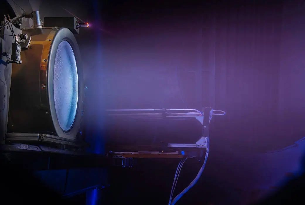
I’ve photographed ion engine tests where the plasma glow is so faint you need long exposures to capture it at all. Beautiful, in its way. Technically important. But to anyone outside that lab, it’s just a blue glow in a vacuum chamber. The engineering is revolutionary. These engines will power missions to asteroids, to the outer planets, to destinations that conventional rockets can’t efficiently reach. But how do you make people care about that? How do you translate “higher specific impulse” into something that makes someone stop scrolling?
Earthrise answers that question by refusing to give you a choice. It doesn’t inform you that Earth is finite. It makes you feel how finite it is. It creates a sense of scale that your body understands before your mind has time to analyze it. You don’t think “approximately 8,000 miles.” You see a sphere you could cover with your thumb from across the room, and you know instantly, wordlessly: that’s it. That’s all of us. That’s home. That’s everything we’ve ever known, everyone we’ve ever loved, every war ever fought, every song ever written, right there, floating in the void.
And once you’ve seen it, you can’t unsee it.
Pale Blue Dot
Where Earthrise gives you the whole Earth in one clean, luminous frame, Pale Blue Dot almost refuses to show you anything at all.
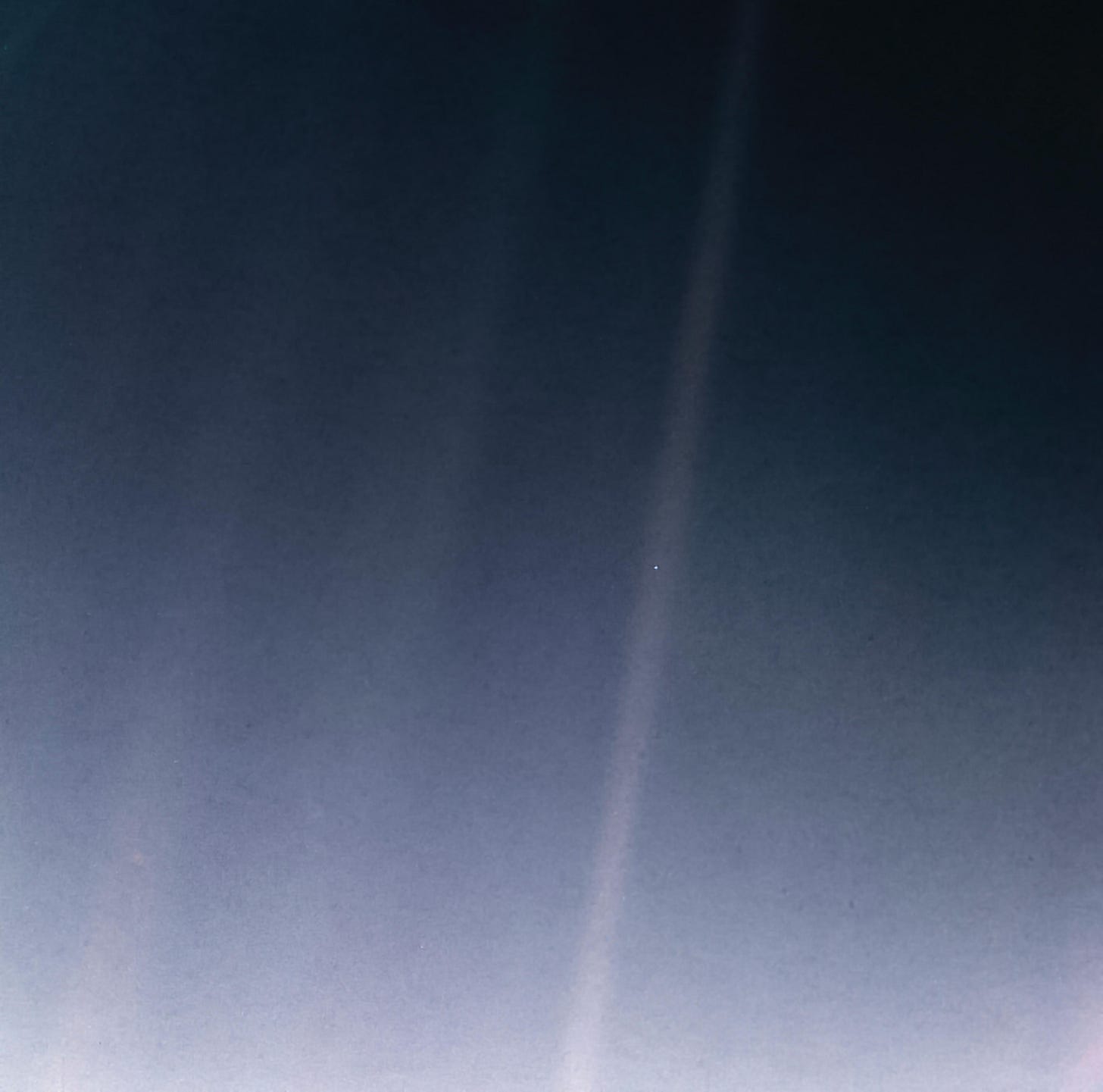
Taken by Voyager 1 from nearly 4 billion miles away (opens in a new window), Earth is barely visible: a pale point of light, 0.12 pixels, suspended in a shaft of scattered sunlight. If you didn’t know what you were looking at, you’d miss it entirely. It’s not a portrait. It’s barely an image.
And yet it carries enormous weight. Unbearable weight, actually.
The difference from Earthrise is instructive. Earthrise overwhelms you with presence. The planet is right there, enormous and vivid and impossible to deny. Pale Blue Dot works through absence. The planet is so small, so easy to overlook, that its very insignificance becomes the point. Both photographs make you feel Earth’s fragility, but through opposite means: one by filling your field of vision, the other by nearly vanishing from it.
When Carl Sagan described Earth as “a mote of dust suspended in a sunbeam” (opens in a new window) in Pale Blue Dot (1994), the words were beautiful. Poetic. Profound, even. But the photograph gave those words a location in physical space. It transformed metaphor into evidence. You weren’t just hearing an astronomer describe smallness. You were seeing smallness, and it was real, and it was home. Numbers describe. Images implicate.
Why This Matters
This isn’t just aesthetic preference. This is how science actually reaches people. How it survives in the public sphere. How it gets funded, trusted, defended, acted upon.
NASA receives less than one percent of the federal budget (opens in a new window). A rounding error, basically. Yet roughly three-quarters of Americans view the agency favorably (opens in a new window). Why? Most people can’t explain orbital mechanics. They couldn’t tell you the difference between the James Webb and Hubble telescopes. They don’t need to. They’ve seen the images.
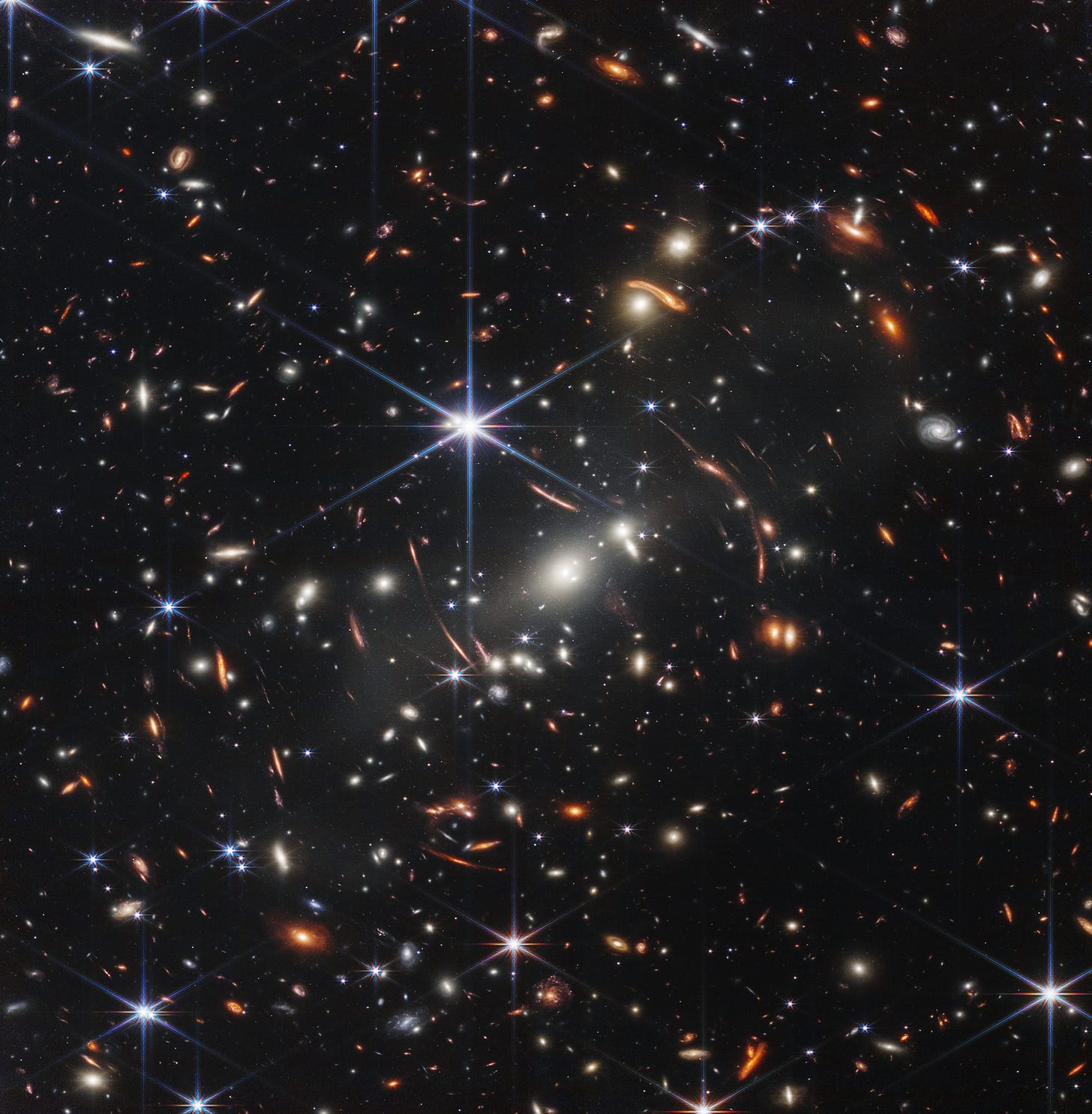
When the public lacks technical expertise; and most of us do, in most fields; imagery becomes the primary interface between science and society. The bridge between the laboratory and the living room. Between discovery and democracy.
Earthrise helped spark the modern environmental movement. Pale Blue Dot reframed our sense of cosmic significance. Together, these photographs demonstrate what Felice Frankel, whose work on scientific visualization has shaped how researchers think about imagery, argues: that visual communication doesn’t merely accompany scientific knowledge; it activates it. It transforms abstract data into something people can grasp, care about, and act on.
And that work continues today. Photographers like Chris Gunn, Bill Ingalls, and Joshua Valcarcel do so much of the heavy lifting when it comes to capturing the imagination and support of the American public. They’re on the ground at launches, in clean rooms with billion-dollar telescopes, documenting the moments that make science feel urgent and real and worth investing in. Their work matters as much as the engineering. Maybe more, in terms of public support. We’ll come back to them, because what they do deserves serious attention.
But first, I want to understand how we got here. How two photographs became the standard for what’s possible when communication is treated as an integral part of scientific work rather than an afterthought.
What’s Coming
Over the next few weeks, I’m going to dig into these questions.
We’ll look at how Earthrise was created: completely by accident, on Christmas Eve 1968, during a routine spacecraft maneuver that nobody expected to produce anything memorable. We’ll trace how a single photograph became the visual symbol that unified the fragmented environmental movement in just sixteen months, catalyzing policy changes that still shape our world today. We’ll examine the behind-the-scenes fight to get Pale Blue Dot taken at all: Carl Sagan versus NASA bureaucracy, with humanity’s perspective hanging in the balance.
And I’ll share what I learned photographing research at NASA Glenn. The tension between documenting for engineers, who need to see every technical detail, every data point, and communicating to the public, who need to understand why any of this matters. What it’s like to photograph an ion thruster test and know that what you’re capturing is revolutionary technology, but to most people it just looks like a faint blue glow in a metal box. How do you bridge that gap? What gets shown versus what stays in the technical archive, and why those choices shape which missions get funded and which get forgotten?
When this ran in March, these were promises. They’re all published now.
- FTC-002The Accidental Masterpiece: How Earthrise Happened
- FTC-003From Space Photo to Environmental Movement in 16 Months
- FTC-004The Loneliest Photograph Ever Taken
- FTC-005You Probably Won’t Get It Until You See It
Because here’s what I keep coming back to: images don’t just illustrate science. They determine whether science gets funded, trusted, and acted upon. Whether it survives public scrutiny. Whether it reaches the people who ultimately decide what it’s worth.
If two photographs could do what Earthrise and Pale Blue Dot did, we have to ask what else we’re missing. What makes certain images stick while others disappear? And how do we communicate complex, critical ideas in a world that’s increasingly visual, increasingly skeptical, and increasingly overwhelmed by information?
Those questions feel urgent right now for a specific reason. We’re entering a moment when the persuasive power of images; the very thing that made those photographs so transformative; is being systematically undermined. If photographs can no longer be trusted as evidence, what happens to the bridge between science and the public that they’ve spent sixty years building?
That’s where this series is heading.
Sources and further reading
- Sagan, Carl. Pale Blue Dot: A Vision of the Human Future in Space. Random House, 1994. The source of the “mote of dust” passage and the philosophical framework behind the photograph.
- Pew Research Center. “Americans’ Views of Space.” July 2023. The 73% favorability figure. Link to this source (opens in a new window)
- USAFacts. “NASA Budget.”. The less-than-one-percent federal spending figure. Link to this source (opens in a new window)
- Wikipedia. “Pale Blue Dot.”. Distance and pixel data for the Voyager 1 photograph. Link to this source (opens in a new window)
- Frankel, Felice. Visual Strategies: A Practical Guide to Graphics for Scientists and Engineers. Yale University Press, 2012. On visual communication as an active component of scientific work.